
Kia’s Confusing Logo
When it comes to design, the importance of typography can’t be overstated. It can contribute to brand recognition, info hierarchy, and overall legibility.
For those who aren’t familiar with the term “typography”, it’s the strategic arrangement of type in order to make written language readable and visually appealing. In graphic design, typography’s two main purposes are to:
- Communicate a message
- Promote legibility
If one’s typography is failing in either of these objectives, it can greatly affect the desired response from the intended target audience.
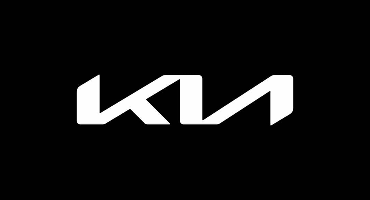
Anyone in the field of design or marketing understands how important brand recognition is, and car companies are among the most recognizable in the world. In early 2021, Kia noticed that companies like Nissan, Volkswagen, BMW, and GM were all rebranding and decided to hop on the bandwagon. Their solution to an outdated and juvenile logo was to design something bold, stylized, and immediately recognizable.
They succeeded in all of those and still, unfortunately, missed the mark.
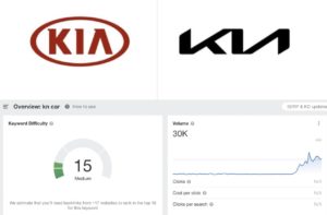
The shortcoming stems from the legibility of the logo, which is lost due to how the company decided to connect the K and the I to the A in the middle of the name. One could argue that the legibility here is a matter of opinion and that the logo clearly reads KIA, but you can’t argue with Google Analytics.
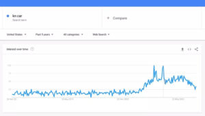
According to Google, over thirty thousand people a day Google the letters KN, thinking that the stylized logo is portraying a backward N instead of an I and A.
While the new KIA logo isn’t the worst logo taboo we’ve seen before, it is a detrimental one and has clearly been confusing drivers since it was unveiled. Here at Mad Men Marketing, we understand how important it is to have a brand logo that not only speaks to you and your business but is legible and above all, effective.
5 Pillars of Branding
What Are Brand Pillars?
Brand Pillars are a set of principles businesses can use to define their unique position in their industry. These “pillars” are broken up into five categories and define the company’s brand as well as how it sets itself apart from its competitors. Seems simple, right? Well, a business’s brand can be a lot more complex than it may seem on the surface. Most people are familiar with how a company uses a logo and other written elements like a tagline or slogan, but brands also tap into your emotions to convey their values, feelings of trust, and product or service superiority. The main brand pillars are purpose, perception, personality, position, and promotion. It takes a deep level of strategy and consistency to communicate your company’s values in a way that resonates with your target audience, and these pillars can help us zero in on what those values are.
Pillar 1 — Purpose
Purpose is the mission and foundation of your company. It’s why your company exists (beyond wanting to earn a living), and it’s what gets you up in the morning eager to work. Purpose is the answer to the biggest question your company needs to be able to answer: Why?
A few things to consider when answering this question:
- What drives the brand
- Do we solve a problem?
- How do we impact our customers, employees, and community?
- What do we want our legacy to be?
- What are we, as an organization, proud of?
Pillar 2 — Perception
Perception is how your customers experience your brand. There are a variety of brand touchpoints that give you the opportunity to shape the perception of your brand like your website, advertisements, social media, community presence, and of course, customer service. First, you must understand your brand perception in order to shape it appropriately. Try asking yourself the following questions:
- How do we think customers perceive our brand?
- Is this how we want to be perceived?
- Is our brand misinterpreted, and if so, where does it stem from?
- Are we effectively communicating our positioning?
- What do people think of our competitors?
Pillar 3 — Personality
This pillar helps describe your brand’s behaviors, emotions, and human characteristics. This will influence your brand’s voice, design, color palette, and much more. It’s your brand’s opportunity to foster that immediate connection between you and your clients or customers. When developing your brand’s personality, think about the following questions:
- How would we describe the business if it were a person?
- Do we look, act, or sound too similar to our competition?
- Is our personality authentic to who we really are?
For more information on brand personalities, check out our blog on Brand Archetypes
Pillar 4 — Position
Brand positioning is defining how your brand is perceived. Everyone thinks about a brand in a very specific way. People don’t typically think about Toyota the same way they think about Mercedes. By defining your business’s position very specifically, you can build brand loyalty among your target audience. Figure out your brand’s position by asking the following questions:
- Who is the target audience?
- Does our current position resonate with our target audience, or do we need to evolve our position?
- What are our 5-year goals versus our 10-year goals?
Pillar 5 — Promotion
Promotion is all about how you engage your audience. How are you enticing your audience to choose you over your competitors? Brand promotion differs greatly from product promotion in the sense that brand position is trying to establish a connection between your business and its customer or client that will hopefully turn into a long-term relationship. Product promotion is more of a short-lived transaction based on selling a service or product. Effective brand promotion puts your business in front of the right people, at the right time, in the right context. Think about the following questions:
- How are we currently promoting ourselves?
- When do our customers need us and where can they find us?
- How do we get our brand in front of more customers?
Now, more than ever, people are looking for a brand that stands for something and that they can connect with on a personal level. Brand pillars are the foundation of any business and are vital in creating your messaging, communication, and business strategy. By using this process, and carefully articulating your brand pillars, Mad Men Marketing can ensure that your brand will reach and affect the hearts and minds of your target audience.
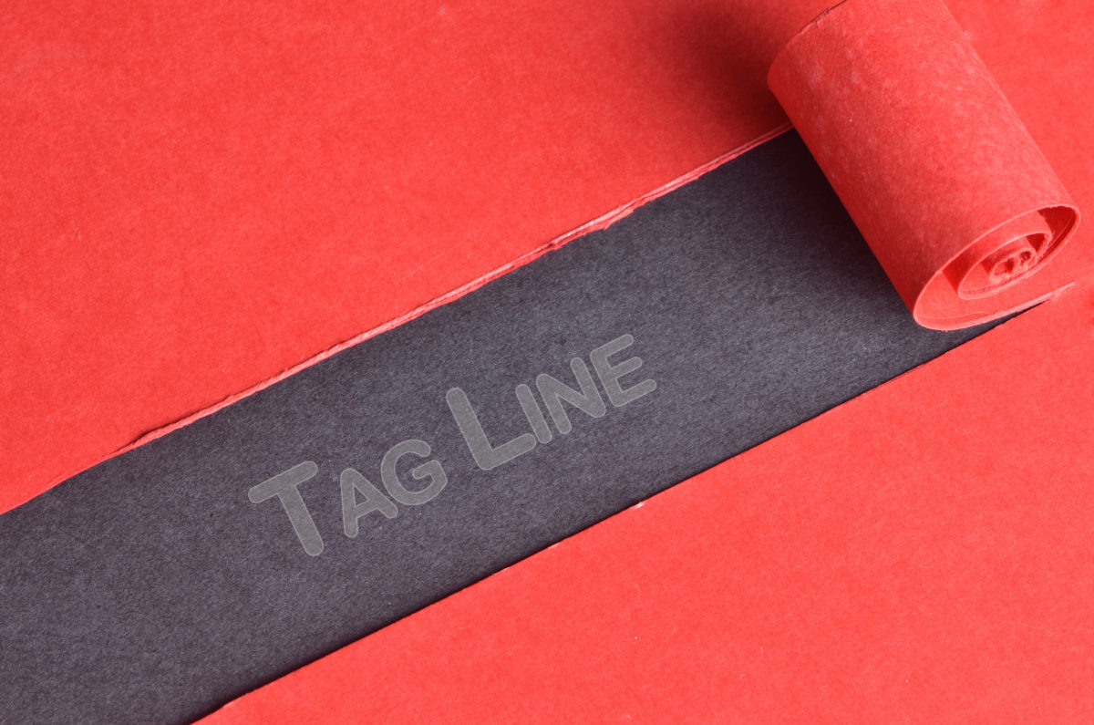
Just Do It: Write a Powerful Tagline
You want the name of your business to be on everyone’s lips. But, what if it wasn’t your name that everyone knew, but a short sentence that conveys your mission in a fun way?
We won’t beat around the bush. We’re talking taglines.
If you’re in the process of brainstorming a tagline or have yet to figure out how to work a tagline into your brand identity, don’t worry, we’re here to break it all down:
Tapping Into Taglines
Cambridge Dictionary defines a tagline as “a short, easily remembered phrase that a company uses in its advertisements, especially on television or the internet, so that people will recognize it or its products.”
In fact, you can probably recognize more taglines than you realize. Tell us: Which brands do these taglines belong to?
- I’m Lovin’ It
- Just Do It
- Think Different
- The Happiest Place on Earth
Now, let’s stop to consider what else these taglines have in common. Simply put, they cultivate a positive sentiment among their audiences, thereby influencing the overall decision of would-be consumers.
So if you were to determine how “successful” your tagline is, you might try asking yourself…
- Is my tagline memorable?
- Does my tagline evoke a positive feeling that resonates with what I’m selling?
Tag, You’re It…
It’s important that you don’t just think of your tagline as a line of copy to go on your product packaging. From food, to products, to theme parks, and more…. A brand’s tagline is arguably one of the most enduring elements featured in its overall identity.
That’s why the power of a tagline cannot be overstated: Because first impressions won’t be the last.
“Taglines also have the potential to build value over time,” as explained by Forbes. “When you use a tagline for long enough, it can become one of the most memorable parts of your identity. Audiences may even become more likely to remember your tagline than your company name.”
Conversely, keep in mind that a bad tagline has the potential to negatively impact your brand, so choose wisely.
Interact, Don’t Interrupt
With that being said, if you’re only beginning to dip your toes into the wide waters of marketing — or if you are otherwise unsure of how far your efforts have taken you in the past — there is no shame in reaching out for help.
“In essence, catch what your company or brand stands for in as succinct a manner as possible,” Marketing Epic advises. “When in doubt, it’s always beneficial to consult your marketing or advertising agency for guidance.”
Thankfully, Mad Men Marketing has the wit, the know-how, and the creativity to help you craft your tagline with confidence.
After all, here at Mad Men Marketing, we are rooted in the belief that brands should interact with their customers, not interrupt them — in fact, it’s in our tagline — and we’d love to help you do the same.
So, are you ready to interact? If so, contact Mad Men Marketing today by calling (904) 355-1766!

5 of the Most Expensive Logos
When looking at a business, a logo is often the first thing you see and the main brand image that people are most likely to remember. A thoughtful, well-managed brand has the potential to add significant financial value to its company.
Some business owners may view a logo as just a graphic they need to put on a business card for legitimacy. Others may think of it as the face of their company, or an icon they can build their entire brand around.
The actual monetary value of a logo may be different from business to business, but some companies out there have shelled out some serious cash for their iconic looks with price tags that are sure to surprise you.
-
Symantec
Price Tag: $1,280,000,000
Symantec is a security program developing company that was established in 1982 in the United States and changed its name to NortonLifeLock in 2019. The business operates worldwide and is one of the largest in its field.
The Symantec logo is a very recognizable one. It’s made up of a simple emblem and a wordmark. The Symantec emblem is a black check encompassed by a yellow circle. This symbolizes protection and quality. The Symantec wordmark, placed on the right of the emblem, is a bold sans-serif typeface, which looks simple yet professional.
The validity of this logo’s price tag is debatable. Symantec purchased a company, Verisign, in 2010 for $1.28 Billion. One of the most valuable aspects of Verisign was its iconic checkmark that Symantec integrated into its brand after the buyout.
-
BP
Price Tag: $210,000,000
The second most expensive logo in the world goes to British Petroleum. BP, formerly known as the British Petroleum Company, is an oil company that was established in the 1950s. Today, the company operates worldwide and has gas stations in over 70 countries around the world. BP is one of the world’s leaders in the industry.
BP is notorious for its impact on the environment, so in 2000, with the help of Landor Associates, it executed a rebrand to help fight that pre-existing stigma. BP’s current logo is in the shape of a flower, with vivid tones of green and yellow, giving the brand a fresh and exciting look.
-
BBC
Price Tag: $1,800,000
BBC is a British public service broadcaster that was founded in 1922. It’s headquartered in Westminster, London, and it is the world’s oldest national broadcasting organization. Besides the UK, it is the most well-known public broadcaster in the world.
In 2021, BBC began to phase in the first update to its logo in over 20 years. Closely based on its previous version, it maintains its basic form of the existing logo used since 1997, but the blocks have more space between them and slightly smaller lettering. The new lettering is in BBC Reith, the BBC’s proprietary font, introduced in 2017 and designed by Dalton Maag.
-
Citibank
Price Tag: $1,500,000
Citibank is an American banking corporation, which was established in 1955 in New York. Today Citibank is an international institution with more than two thousand offices in almost 20 countries around the world.
The timeline of the bank’s logo can be divided into two periods — the era of First National City Bank, from 1955 to 1976, and the Citibank period, which started in 1976 with the company’s rebranding. The company merged with Travelers Insurance Group in 1998 and started working on its rebrand, in collaboration with the famous Pentagram agency. Travelers Group had a very recognizable logo — a red umbrella, symbolizing protection and security. Paula Scher, one of the Pentagram designers, created a very minimalist logo, which was instantly accepted by the company and became one of the most iconic emblems in modern history.
-
Pepsi
Price Tag: $1,000,000
Pepsi is one of the most well-known beverage brands in the world. Its logo is a combination of red, white, and dark blue inside a circular shape, and it looks appealing due to a “smile” effect, created by the white swirl inside the circle.
Pepsi’s logo evolution includes 16 different variations dating all the way back to 1893. The most recent redesign was done by The Arnell Group in 2008 and is reported to have cost Pepsi $1 million.
Obviously, these are insane numbers that companies paid for a rebrand. But the takeaway here is the importance of the logo in brand promotion and marketing strategy.
So, whether you’re in the market for a $1 billion logo, or maybe something a little more affordable, Mad Men Marketing can help you build a brand worth more than you paid.
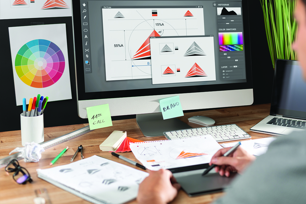
Brand Guidelines 101
What Is A Brand Guideline?
A thorough brand guideline or style guide is a must-have for any business, big or small. The purpose of a brand guideline is to break down your company’s personality and aesthetic in a document for other creatives to utilize. By providing a comprehensive manual for designers to use, you can ensure that the message, tone, logo, and design elements are all used properly, thereby protecting the visual identity of your brand.
Let’s Break It Down
Brand guidelines cover seven key points:
- An Overview
- Mission Statement
- Logo Usage
- Color Palette
- Fonts
- Imagery
- Mockups
Overview
An overview is used to set the expectations for both your customers and your team. This is an opportunity for you to explain your business’s core values and history. Ask yourself what values are unique to you and your business.
Mission Statement
A mission statement is essentially a brief explanation of the organization in terms of why and how you do what you do. It’s important to explain your purpose and overall intention while supporting your vision and direction. The main two questions to ask yourself while writing a mission statement are: “What is our company’s purpose?” and “Why does our company exist?
Logo Usage
Designers create logos to be used in a variety of ways, and people without the proper experience or knowledge can easily use a logo incorrectly. It’s important to provide a detailed visual breakdown of how to use different variations of a logo, the correct use of different background colors, and proper margins surrounding the logo.
Color Palette
Consistency is key when it comes to your color palette. It may not seem that important, but repeated usage of specific colors is key when it comes to brand recognition. Companies like Google and UPS are immediately recognizable due to their color palette. The more people can recognize your brand, the more effective your advertisements can be.
Fonts
The consistency and variety of fonts are just as important as the color palette. In your brand guidelines, you want to display each font your brand uses, along with their font family (variety of weights the font offers). A good rule thumb is to utilize two to three fonts — one for headers, one for body copy, and one for your logo (which may be one of the previous two).
Design Elements
When designers create a brand, specific design elements other than the logo are created to help with visual recognition. Whether it’s a specific shape, background, texture, pattern, or illustration, having consistent imagery will help consumers link visuals to your brand, making them more likely to interact.
Mockups
Providing a visual representation of how you utilize the brand is key. This is usually in the form of business cards, letterhead, apparel, and other swag. This gives anyone looking at your brand guideline a cohesive snapshot of how your company visually promotes itself in various ways.