

When looking at a business, a logo is often the first thing you see and the main brand image that people are most likely to remember. A thoughtful, well-managed brand has the potential to add significant financial value to its company.
Some business owners may view a logo as just a graphic they need to put on a business card for legitimacy. Others may think of it as the face of their company, or an icon they can build their entire brand around.
The actual monetary value of a logo may be different from business to business, but some companies out there have shelled out some serious cash for their iconic looks with price tags that are sure to surprise you.
-
Symantec
Price Tag: $1,280,000,000
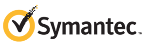
Symantec is a security program developing company that was established in 1982 in the United States and changed its name to NortonLifeLock in 2019. The business operates worldwide and is one of the largest in its field.
The Symantec logo is a very recognizable one. It’s made up of a simple emblem and a wordmark. The Symantec emblem is a black check encompassed by a yellow circle. This symbolizes protection and quality. The Symantec wordmark, placed on the right of the emblem, is a bold sans-serif typeface, which looks simple yet professional.
The validity of this logo’s price tag is debatable. Symantec purchased a company, Verisign, in 2010 for $1.28 Billion. One of the most valuable aspects of Verisign was its iconic checkmark that Symantec integrated into its brand after the buyout.
-
BP
Price Tag: $210,000,000
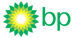
The second most expensive logo in the world goes to British Petroleum. BP, formerly known as the British Petroleum Company, is an oil company that was established in the 1950s. Today, the company operates worldwide and has gas stations in over 70 countries around the world. BP is one of the world’s leaders in the industry.
BP is notorious for its impact on the environment, so in 2000, with the help of Landor Associates, it executed a rebrand to help fight that pre-existing stigma. BP’s current logo is in the shape of a flower, with vivid tones of green and yellow, giving the brand a fresh and exciting look.
-
BBC
Price Tag: $1,800,000
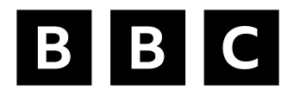
BBC is a British public service broadcaster that was founded in 1922. It’s headquartered in Westminster, London, and it is the world’s oldest national broadcasting organization. Besides the UK, it is the most well-known public broadcaster in the world.
In 2021, BBC began to phase in the first update to its logo in over 20 years. Closely based on its previous version, it maintains its basic form of the existing logo used since 1997, but the blocks have more space between them and slightly smaller lettering. The new lettering is in BBC Reith, the BBC’s proprietary font, introduced in 2017 and designed by Dalton Maag.
-
Citibank
Price Tag: $1,500,000
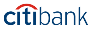
Citibank is an American banking corporation, which was established in 1955 in New York. Today Citibank is an international institution with more than two thousand offices in almost 20 countries around the world.
The timeline of the bank’s logo can be divided into two periods — the era of First National City Bank, from 1955 to 1976, and the Citibank period, which started in 1976 with the company’s rebranding. The company merged with Travelers Insurance Group in 1998 and started working on its rebrand, in collaboration with the famous Pentagram agency. Travelers Group had a very recognizable logo — a red umbrella, symbolizing protection and security. Paula Scher, one of the Pentagram designers, created a very minimalist logo, which was instantly accepted by the company and became one of the most iconic emblems in modern history.
-
Pepsi
Price Tag: $1,000,000
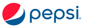
Pepsi is one of the most well-known beverage brands in the world. Its logo is a combination of red, white, and dark blue inside a circular shape, and it looks appealing due to a “smile” effect, created by the white swirl inside the circle.
Pepsi’s logo evolution includes 16 different variations dating all the way back to 1893. The most recent redesign was done by The Arnell Group in 2008 and is reported to have cost Pepsi $1 million.
Obviously, these are insane numbers that companies paid for a rebrand. But the takeaway here is the importance of the logo in brand promotion and marketing strategy.
So, whether you’re in the market for a $1 billion logo, or maybe something a little more affordable, Mad Men Marketing can help you build a brand worth more than you paid.