interact, don't interrupt

  • Home
  • Work
    The AD-Verse
  • Our Agency
    Mad Lab
    • About Us
    • Team
    • Why MMM?
      • Implementation
      • Ideas
      • Foresight
      • Mission: AIA
  • Our Capabilities
    What We Can Do
    • Design
      • Brand Engineering
      • Print Collateral
      • Outdoor
      • Digital Display
      • Direct Mail
    • Digital
    • Research
      • Analytics
    • Strategy
      • Omni-Channel Planning
      • Events
    • The-Ographies
      • Videography
      • Photography
      • Typography
    • Web Dev
      • WordPress
      • UI/UX
      • Design
      • eCommerce
  • Blog
    Awesome Insights
  • Contact Us
Mad Men Marketing

Kia’s Confusing Logo


Skip to the content
Categories
Branding Creative

Kia’s Confusing Logo

  • Post author By Ryan Blair
  • Post date November 17, 2022
An image of the newest Kia logo on a black backdrop with white font

When it comes to design, the importance of typography can’t be overstated. It can contribute to brand recognition, info hierarchy, and overall legibility.

For those who aren’t familiar with the term “typography”, it’s the strategic arrangement of type in order to make written language readable and visually appealing. In graphic design, typography’s two main purposes are to:

  1. Communicate a message
  2. Promote legibility

If one’s typography is failing in either of these objectives, it can greatly affect the desired response from the intended target audience.

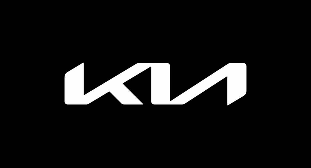
Anyone in the field of design or marketing understands how important brand recognition is, and car companies are among the most recognizable in the world. In early 2021, Kia noticed that companies like Nissan, Volkswagen, BMW, and GM were all rebranding and decided to hop on the bandwagon. Their solution to an outdated and juvenile logo was to design something bold, stylized, and immediately recognizable.

They succeeded in all of those and still, unfortunately, missed the mark.

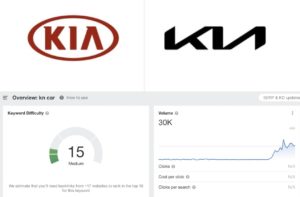
The shortcoming stems from the legibility of the logo, which is lost due to how the company decided to connect the K and the I to the A in the middle of the name. One could argue that the legibility here is a matter of opinion and that the logo clearly reads KIA, but you can’t argue with Google Analytics.

According to Google, over thirty thousand people a day Google the letters KN, thinking that the stylized logo is portraying a backward N instead of an I and A.

A Google Analytics page shows how the search for "kn car" increased with Kia's new logo
A Google Analytics page shows how the search for “kn car” increased with Kia’s new logo
A graph illustrates how the Google search for "kn car" increased with Kia's new logo over time
A graph illustrates how the Google search for “kn car” increased with Kia’s new logo over time

While the new KIA logo isn’t the worst logo taboo we’ve seen before, it is a detrimental one and has clearly been confusing drivers since it was unveiled. Here at Mad Men Marketing, we understand how important it is to have a brand logo that not only speaks to you and your business but is legible and above all, effective.

  • Tags branding, branding design, logo, logo design, marketing tips

← 5 Pillars of Branding → Small Business Saturday: S.H.E. Matters — And It Is Her Business.

INTERACT, DON'T INTERRUPT

Need a more interactive marketing experience? Look no further.

Lets Talk Today

904-355-1766

Lets Talk Today

Get The Latest Updates
SIGN UP FOR OUR NEWSLETTER

SOCIAL MEDIA ACCOUNTS
Facebook-square
Instagram
Twitter-square

TALK TO US TODAY

All Rights Reserved. Mad Men Marketing. © 2025
MENU
  • Home
  • Work
  • Our Agency
    • About Us
    • Team
    • Why MMM?
      • Implementation
      • Ideas
      • Foresight
      • Mission: AIA
  • Our Capabilities
    • Design
      • Brand Engineering
      • Print Collateral
      • Outdoor
      • Digital Display
      • Direct Mail
    • Digital
    • Research
      • Analytics
    • Strategy
      • Omni-Channel Planning
      • Events
    • The-Ographies
      • Videography
      • Photography
      • Typography
    • Web Dev
      • WordPress
      • UI/UX
      • Design
      • eCommerce
  • Blog
  • Contact Us